Q3 2023 Investment Update
Summary
- The Federal Reserve interest rate policy and bond yields again took center stage during the quarter as economic growth continued to be solid while inflation persisted
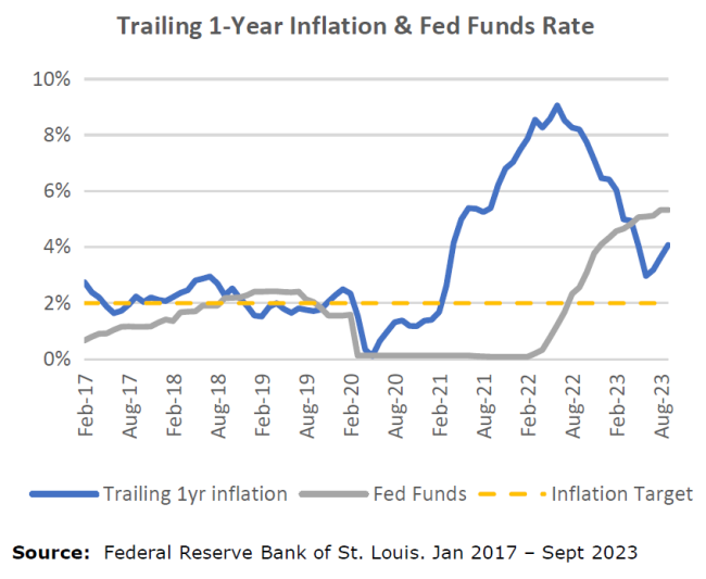
- Using the Cleveland Fed’s Inflation Nowcasting model, headline CPI rose by 0.4% in September, leaving the trailing 1-year rate at 4.1%, down significantly from its recent 9.1% peak, but still double the Fed’s long-term target
- The sharp spike in bond yields spilled over to equity markets late in the quarter as both major asset classes sold off, bonds more than stocks
- Commodities – specifically oil – was the one asset class with positive performance, though that is now contributing to rising costs at the pump
Market Summary
From a mainstream news flow perspective, it was a relatively quiet quarter. Union worker strikes with the Hollywood writers and the United Auto Workers were notable, though had little influence on financial markets and the economy. There was little progress in either direction on the Russia- Ukraine conflict and there were no new incidents in the increasingly cold relationship between the US and China. The build up to the US Presidential election remains in its early stages and is not yet relevant to financial markets. This left us with economic data – headlined by the ongoing battle against inflation – and other seasonal effects that drove financial markets.
Rising bond yields have again taken centerstage. The yield on the 10-year Treasury bond hit a 2023 low of 3.4% in March and ended the 3rd quarter at 4.6%, a level not seen in more than 15 years. Bond yields and bond prices have an inverse relationship, which meant another pronounced downturn in Treasury bonds in Q3. The strong performance for equity markets year-to-date hit its 2023 peak in July and has since retreated with September representing the worst monthly performance of the year for the S&P 500. Below we show Q3 and trailing 1-year performance for a range of asset classes as well as a longer-dated chart for the US 10-Year Treasury Bond yield. The move in yields had a negative effect on virtually all asset classes during the quarter.
Inflation, Fed Policy & the Lag Effects
The Federal Reserve remains in a tricky position, attempting to bring inflation back down to its 2% target while trying to avoid triggering a significant recession. It’s worth restating the Fed’s dual mandate, which is to pursue maximum sustainable employment and price stability. All policy and strategy decisions center around these goals and, at present, unemployment sits near historic lows while prices continue to rise at an elevated rate.
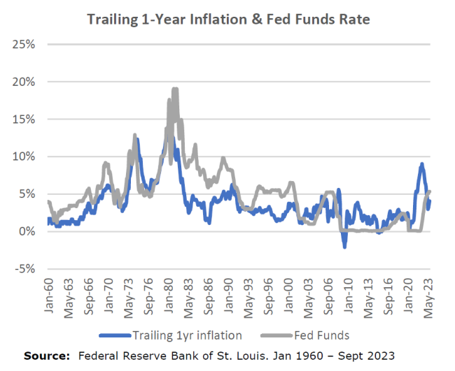
While not affiliated with any party, the Fed must exercise some political savvy with its messages to the general public. They need consumers to slow their spending to lessen demand and would welcome a rise in unemployment from historic lows for this to happen. It has raised interest rates 5.25% over the last 18 months, the fastest pace since the early 80’s under the Paul Volcker-led Fed. Until there is more pain felt in the wallets of the American public, consumer demand will continue, which will keep putting upward pressure on prices and cause the Fed to remain biased towards higher rates. The following charts show the Fed Funds rate and trailing 1-year inflation. The first chart provides a shorter window reflecting current conditions. The second chart captures more than 60 years’ worth of data, providing historical context to current conditions. The Fed is committed to avoiding a 70’s-style inflation and knows it must see considerable economic slowing in order to achieve this goal.
The real economic effects of the Fed’s rate hikes tend to happen with a lag. How long of a lag and how significant the effects is something the Fed is scrutinizing. We saw some tangible signs earlier in the year with the bankruptcies of Silicon Valley Bank, Signature Bank, and First Republic, though these events were resolved without further contagion. Since then, there has been little evidence of an economy tracking towards a material slowdown, at least as it relates to actual economic output. The below chart shows the last four years of nominal US GDP growth by quarter. Since the trough in activity in Q2 2020, nominal growth has generally remained solid.
In addition to setting the base interest rate, the Fed is also a market participant and, specifically, uses its balance sheet to buy and sell a range of Treasury and quasi government bonds. By doing this, it can influence bond yields – or the rate being paid on fixed income securities with longer maturities after accounting for the purchase price. While the Fed transacting in the secondary market is done alongside all other market participants – public and private – it is large enough to have some influence on bond yields. And, as part of its tightening policy, it has stopped its purchases of bonds while allowing the proceeds of its maturing debt to return to its balance sheet (as opposed to buying more bonds). Removing a major buyer of bonds has had an upward effect on interest rates, which pushes prices down.
As a result of the Fed tightening and rising yields, we have seen a significant increase in borrowing costs, which had been historically cheap for nearly 15 years following the Great Financial Crisis. That regime change came quickly; as of Sept 30, the average 30-year fixed mortgage had a rate of 7.3% after bottoming out at 2.7% in early 2021. The chart below shows a hypothetical monthly payment for a $500,000 loan for each leg of the above scenario. The $1400 difference in payment is about a 70% increase in a little over a 2.5 year period
The second chart shows the average interest rate on all US credit card balances along with the total amount of US credit card debt. Using data back to 1999, the average rate on credit cards with balances is at its highest level over this period at an astounding 22%.
Record US debt levels – public and private – along with cyclically peaking interest rates puts greater pressure on consumers and companies’ ability to service this debt. Ultimately, we believe this dynamic is unsustainable. The likely result will be a consumer’s reduced capacity to spend, a rise in debt defaults, and an increase in unemployment. When that happens is the big question, though we expect it will be sooner than later. That will be the catalyst for a recession and an expected inflection point in the current interest rate regime.
At the end of this quarterly update we have included a section that takes a deeper dive into the inflationary 70’s & early 80’s, previously written about in the Q2 2022 letter. The Fed’s current policy strategy is rooted in lessons from that period. It is critical they extinguish high inflation to avoid prices and interest rates spiraling up over the course of many years.
Managing Through Challenging Environments
After an extraordinarily positive period in financial markets following the 2008-09 Financial Crisis, some of the economic imbalances from a prolonged period of low rates are now biting back. This has been most acute over the last 18- 24 months despite a nice recovery in equity markets earlier this year. It is our view that perhaps stocks had gotten ahead of themselves to some degree, though it is correct that economic conditions have improved from where they were a year ago. Improved conditions should not be confused with good conditions.
Following an initial misread on inflation, the Fed has been clear in its commitment to fight back and that has caused discomfort among a range of financial assets. The path back to its 2% target will require continued vigilance, likely more than what market participants want. However, as the saying goes, “it is darkest just before dawn” is relevant to economic cycles as well. No one enjoys the downturns, but they are an inevitable part of any cycle. And it is these market extremes, when financial fears are elevated, where it is critical to maintain a steady hand.
At Signal Ridge, we have long been advocates of diversified portfolios as the primary defense against market downturns and the best way to grow capital more consistently. We remain committed to – and a range of research supports – building portfolios with a diverse mix of asset classes that respond differently under a range of economic conditions. This typically provides a smoother experience than concentrating our risk in a single asset class and allows capital to compound more effectively over time. Our focus on providing the smoother experience has been a cornerstone for our investing and has proven itself over time. Even if over shorter periods there are environments in which it may struggle, we fully expect this diversification will prove its worth over the coming years.
Studying History to Help Us Understand the Current Environment
We start with the below chart to provide a visual representation of economic conditions in a period known as The Great Inflation, which started in 1965 and lasted until 1982. This period serves as the best learning environment to help us understand what we are going through today.
The thicker black and red lines represent unemployment and inflation, respectively – the two economic gauges that serve as the Federal Reserve’s dual focus. The pink and blue thinner lines represent the Fed Funds rate and the yield on the 10yr Treasury bond. Again, the Fed controls the base rate as part of monetary policy while the market determines the yield on the 10yr bond, though the Fed is a market participant. The shaded light blue bars represent periods where the US economy was in recession.
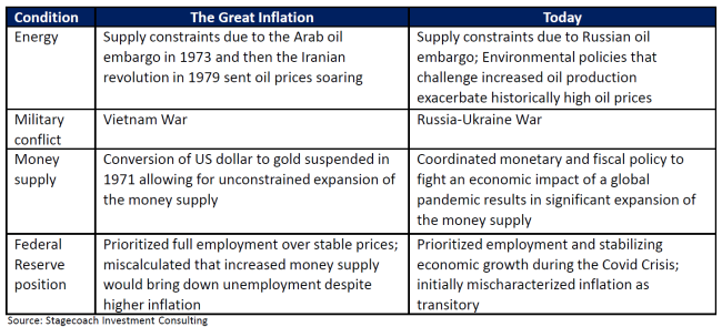
Below is a table of conditions that existed during The Great Inflation as well as today:
This confluence of factors led to an extended period of cyclically rising inflation, unemployment, and ultimately, spiking interest rates. Which factor had a greater role in these conditions extending longer than anticipated is difficult to know. However, as described later by economist Allan Meltzer referencing then Fed Chairman Arthur Burns, “full employment was the first priority in the minds of the public and the government, if not also at the Federal Reserve. But there was also a clear sense that addressing the inflation problem head-on would have been too costly to the economy and jobs.” In hindsight, the Fed was complicit in allowing inflation to persist for too long. It is also perhaps a critical distinction for how Jerome Powell and today’s Fed are intending to manage monetary policy after initially prioritizing employment over inflation as the pandemic unfolded.
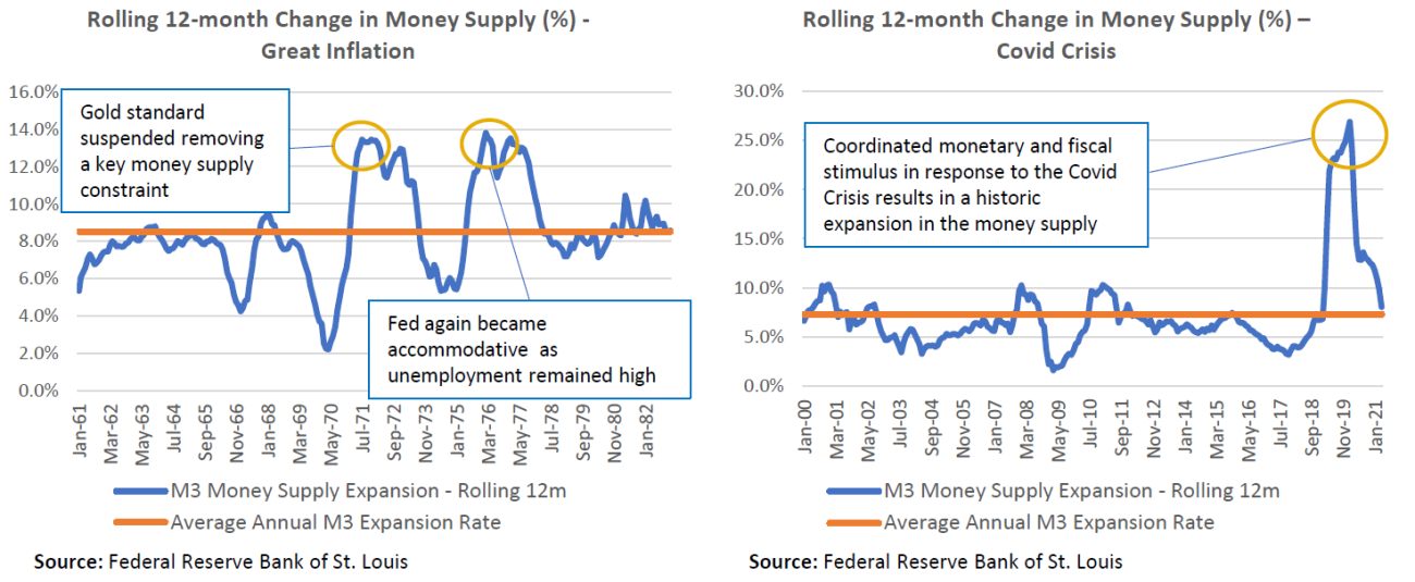
The below charts show the expansion of money supply in the US economy. Think of it as a byproduct of both monetary (the Fed) and fiscal (the government) policy decisions aimed at managing economic conditions. Like inflation, the money supply expands at a natural rate over time.
In August 1971 President Nixon suspended the convertibility of US dollars to gold to respond to rising inflation and unemployment. This provided the foundation for an extraordinary spike in the supply of US dollars and, when combined with the Fed’s bias towards employment over inflation, perpetuated inflationary conditions that went far beyond what the Fed had originally anticipated. Not until Paul Volcker replaced Burns as Fed Chairman in 1979 did the Fed change course to consider inflation equally important as unemployment. It was under Volcker’s leadership where the Fed Funds rate spiked up to 19% in 1981, which ultimately broke the back of inflation. It also came with a peak in unemployment of 10% in 1982, likely a necessary condition to inflation normalizing.
The above right chart shows the current spike in the money supply in response to the Covid Crisis, which brought economic growth to a near standstill and unemployment to a peak of 14.8%. While some stimulus provided a critical safety net to the economy, the sheer magnitude of the combined monetary and fiscal actions caused the economy to overshoot. After seeing how things transpired in the 70’s we have a better idea of how we’ve arrived at the current conditions, though at the time of policymaking the bias was to bring unemployment down through higher than normal economic growth. It’s also fair to say that there were strong political motivations on both sides to be perceived as saving the economy, which further fueled excessive fiscal action.
Important Disclosures and Data Sources
The following indices and securities were used to represent the performance of various asset classes contained in this market commentary:
- US Large Cap stocks – S&P 500 Index; Standard & Poor’s
- US Small Cap stocks – Vanguard Small-Cap Index Fund ETF, which seeks to track the performance of the CRSP US Small Cap Index that measures the investment return of small-capitalization stocks
- Non-US stocks – iShares Core MSCI EAFE ETF, which seeks to track the investment results of the MSCI EAFE IMI Index composed of large-, mid- and small capitalization developed market equities, excluding the U.S. and Canada
- Emerging Market stocks – iShares Core MSCI Emerging Markets ETF, which seeks to track the investment results of the MSCI Emerging Markets Investable Market Index
- Real Estate – real estate returns are represented by the FTSE Nareit U.S. Real Estate Total Return Index Series
- Long Duration Investment Grade Credit – Vanguard Long-Term Corporate Bond Index Fund ETF, which seeks to track the performance of the Bloomberg U.S. 10+ Year Corporate Bond Index
- Long Duration US Treasuries – iShares 20+ Year Treasury Bond ETF, which seeks to track the investment results of the ICE U.S. Treasury 20+ Year Bond Index (the "underlying index")
- Long Duration US TIPS – PIMCO 15+ Year U.S. TIPS Index Exchange-Traded Fund, which seeks to provide total return that closely corresponds, before fees and expenses, to the total return of the ICE BofA 15+ Year US Inflation-Linked Treasury Index
- Gold – World Gold Council, https://www.gold.org/goldhub/data/gold-prices
- Commodities – iShares S&P GSCI Commodity-Indexed Trust, which seeks to track the results of a fully collateralized investment in futures contracts on the S&P GSCI Total Return Index
Important Disclosures
Past performance does not guarantee future results. It is not possible to invest in an index. Performance shown for the SRCP Aggressive model represents an unaudited, asset weighted composite of actual client returns, net of all management fees and before advisor fees, as calculated by the custodian, Charles Schwab. Individual account performance may vary based on inception date of the account, timing of rebalancing, trade execution prices, timing of cash flows, fees, taxes and other potential factors. All views and opinions expressed in this letter are solely those of Signal Ridge Capital Partners, are subject to change at any time without notice, and are not a recommendation to buy or sell any securities.
Signal Ridge Capital Partners is registered investment adviser, CRD No. 167576


